
UPDATED APRIL 22, 2015
 The report from which this graphic was obtained is Here .
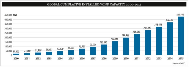
UPDATE: 2015 Cumulative Wind Installations
Wind capacity has risen by nearly 100 fold in the last 20 years. If we see 1 / 10th of that over the next 20 years, wind will be providing about 30% of the world’s electricity needs. The graphic comes from this report.
By 2017 Deutsche Bank projects 50 GW of solar in the US alone:


See also Renewable Energy Cost Curves –
Interactive Graphics on Wind Energy growth –
EIA Graphing tool with link to US windpower growth .
Article showing how poor a job IEA has done at projecting renewables growth . In my experience EIA does a very poor job as well but have not been able to find graphs to show it like this article does for IEA.
PV, Wind, Cumulative Capacity, Capacity
2013 Graph

Pingback: Up To Date Cost Curves for Batteries, Solar and Wind | The Handleman Post
Pingback: Utility Scale Solar Cost Halves in 4 Years | The Handleman Post
Pingback: Growth of Windpower in Fascinating Interactive Graphic | The Handleman Post
Pingback: Study Looking at the Feasibility of 80% Renewables in the US by 2050 | The Handleman Post
Pingback: The ‘Super Grid’ is Super Important for Renewables Part III | The Handleman Post
Pingback: What Percentage of the Worlds Land Area Would Be Required to Run Everything With Solar? | The Handleman Post
Pingback: Popular and ‘Best-Of’ Posts | The Handleman Post